The Red Planter Project
A family real estate practice in Dallas, made official. Years of rentals, flips and new builds needed a name people remember, a brand, and a site that shows the projects without a library of matching photography.
- Client
- The Red Planter Project, Dallas, Texas
- Year
- 2026
- Made
- Logo · Logo kit · Brand guide, 21 pages · Logo animation · Website concept · Project renders
The brand
A low mid-century house in one even line, with one red planter out front. The whole system reads like a set of drawings.
The logo kit · seven lockups in three colorways



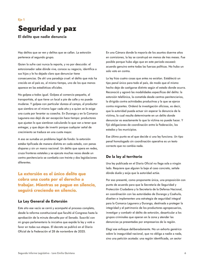
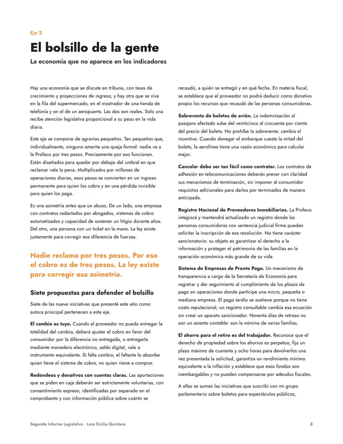
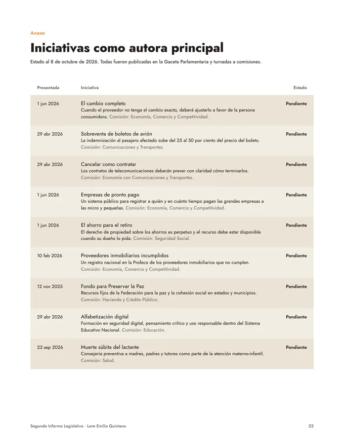
Color · four, in the proportion they are used
#FEFAF4The ground. Most of every page.#141414Lines and type.#CFC8BCSecondary lines only.#A3302COnce per design.Type · three free families
Normandy
A two-story limestone house on a 50 by 180 foot lot, with parking for eleven cars below grade.
001 · Normandy
Residential · Highland Park, TX
Acquired 2011 · 7,978 sq ft
The brand guide · 21 pages, Rev E
The website
An architecture office's portfolio, not a real estate site. The house draws itself, the index switches between image, plan, list and map, and every project gets a title sheet.
A real visit, recorded: the opening sheet, the four project groups, the index in plan, list and map, then project 001.
Open the live site ↗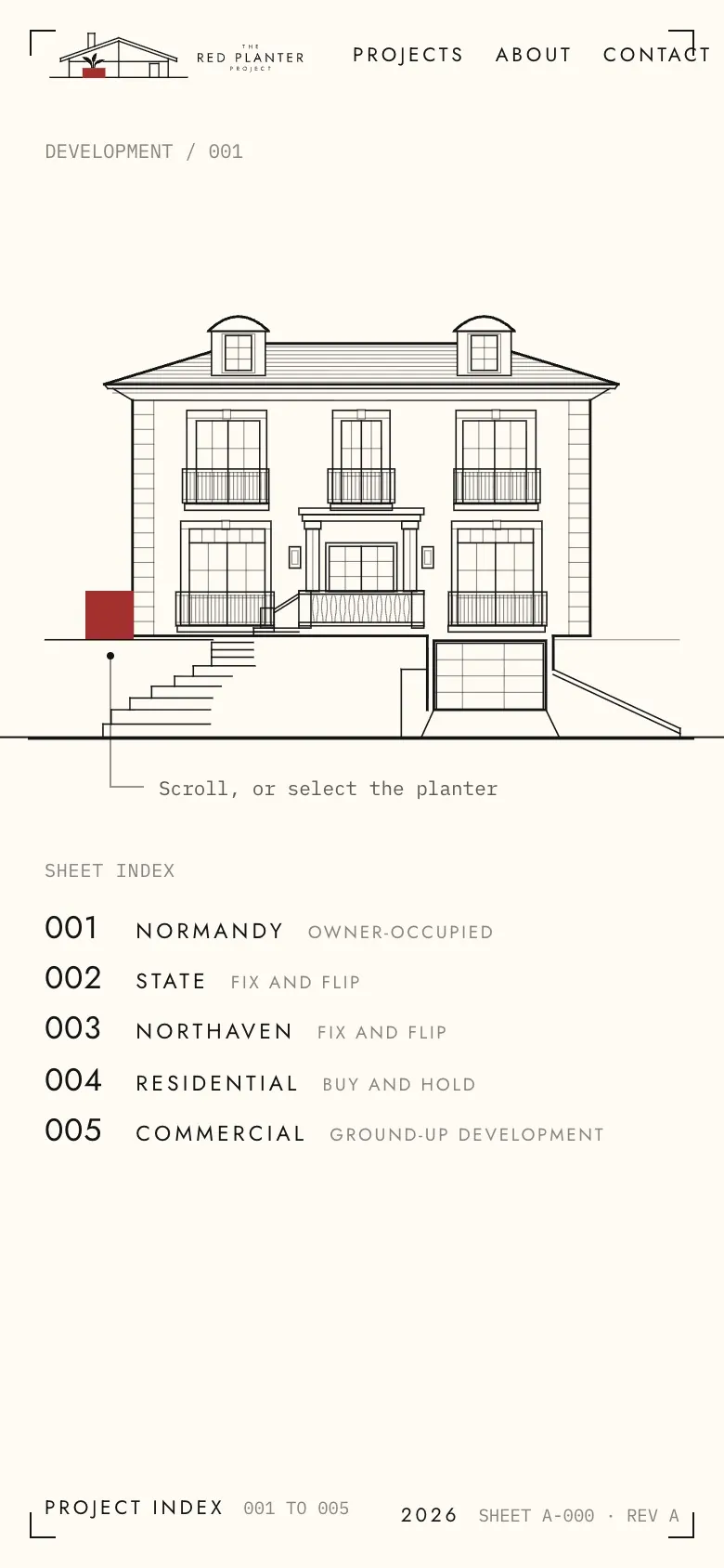
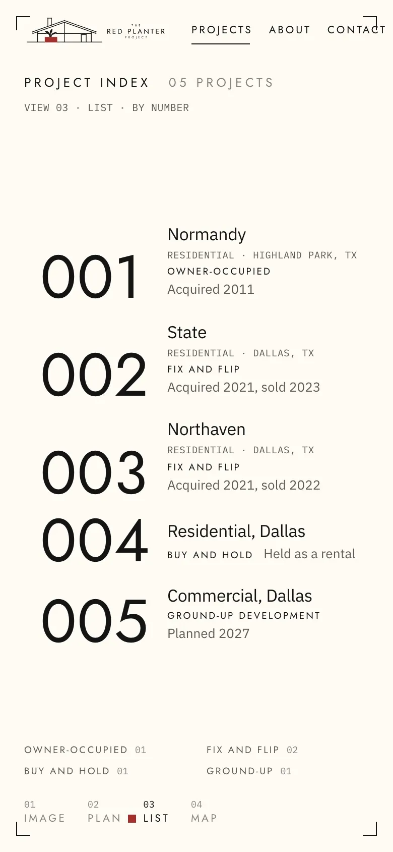
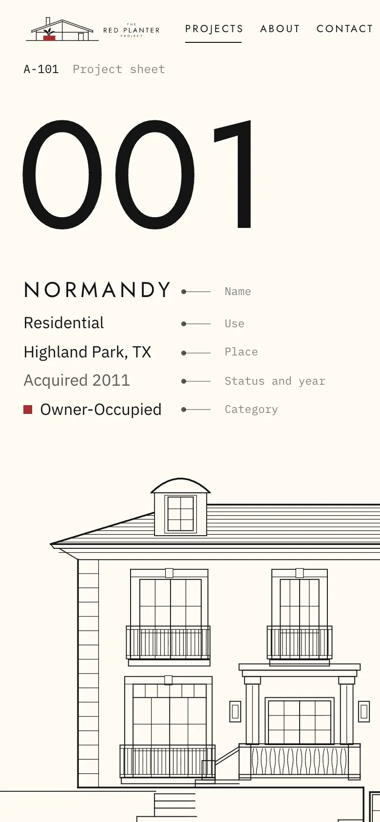
In use
On paper and on screen, the same rules: charcoal on cream, the number first, and red exactly once.
Drawings · front elevations, red marks the new work
Renders
Renders made for the company, one consistent set so the portfolio reads as one. The red planter sits out front of every house.
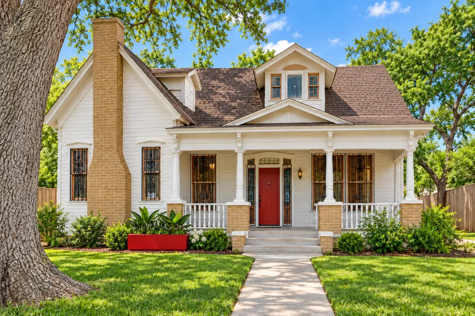
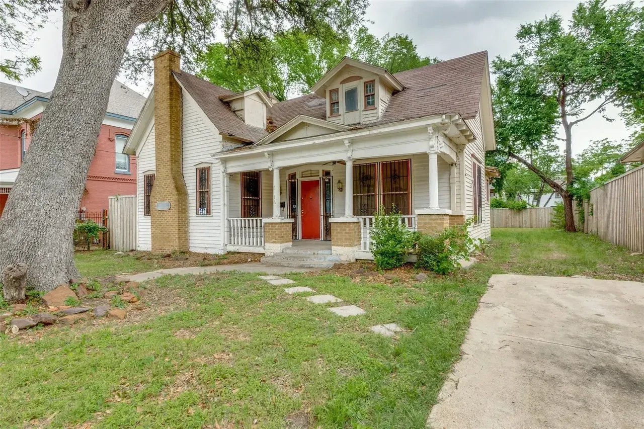 BeforeAfter













 01
 02
 03
 04